QUICKBASE · DESIGN-PROPOSED, DESIGN-LED, DESIGN-EXECUTED
The trial activation overhaul
- Role
- Proposed, prototyped, and led
- Resources
- No dedicated PM or engineering allocation
- Method
- Controlled A/B test, 1,766 users
- Period
- 2023–2024
A blank screen and a thirty-day clock
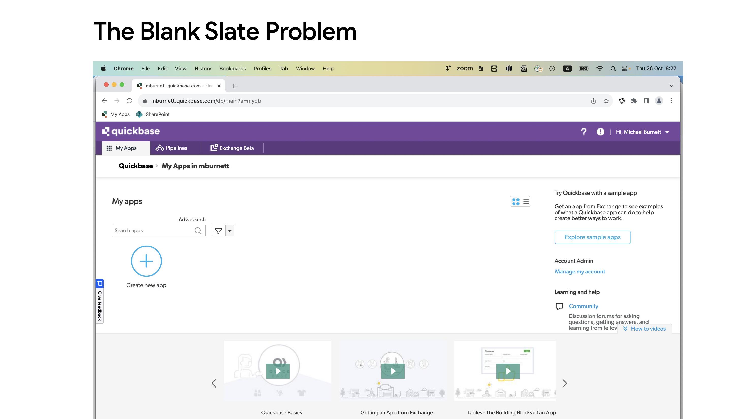
A new Quickbase trial user landed on an empty workspace with a single "Create new app" button and a sidebar of help videos. Thirty days to evaluate an enterprise platform, and the first screen offered no path — just an invitation to build something from nothing, with no indication of what "something" should be.
Proposing work nobody asked for
This was not on the roadmap. I proposed it, prototyped it, and led it through to launch without dedicated PM or engineering resources.
Getting buy-in was the hard part. The company was investing heavily in a generative-AI app builder, and a conventional onboarding flow read as both unglamorous and faintly competitive with the AI effort. So rather than argue for it on principle, I framed it as a falsifiable question the organization would benefit from answering either way:
Hypothesis: a human-designed template flow will outperform generative AI for new-user activation.
If I was wrong, the company would learn something valuable about where to place its AI bets. That framing turned a turf question into an experiment, which is why it got approved.
Studying ten competitors before designing anything
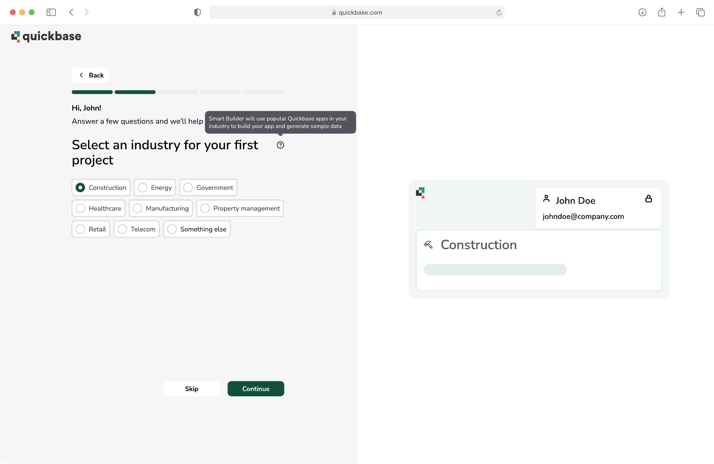
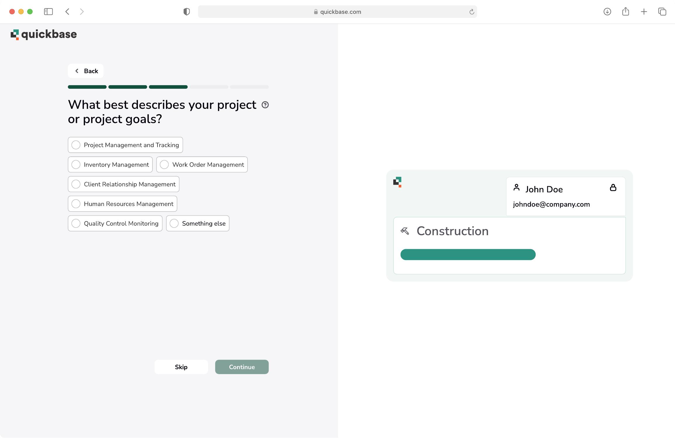
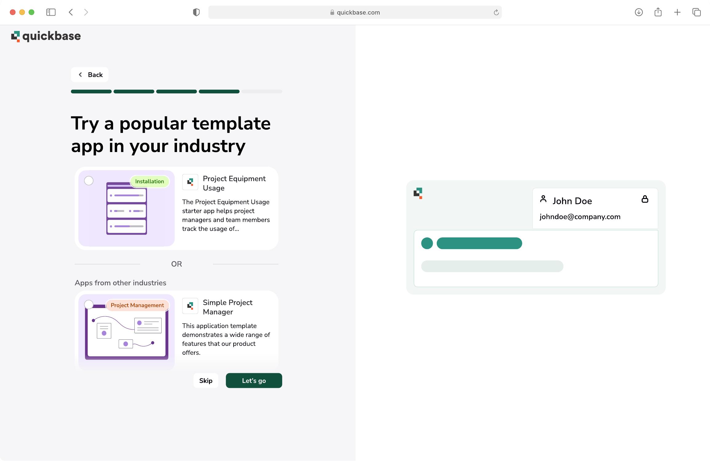
I mapped the full trial-to-activation flow for ten competing products — Zapier, Smartsheet, Monday.com, Airtable, ClickUp and others — breaking each into identify, build, and navigate phases.
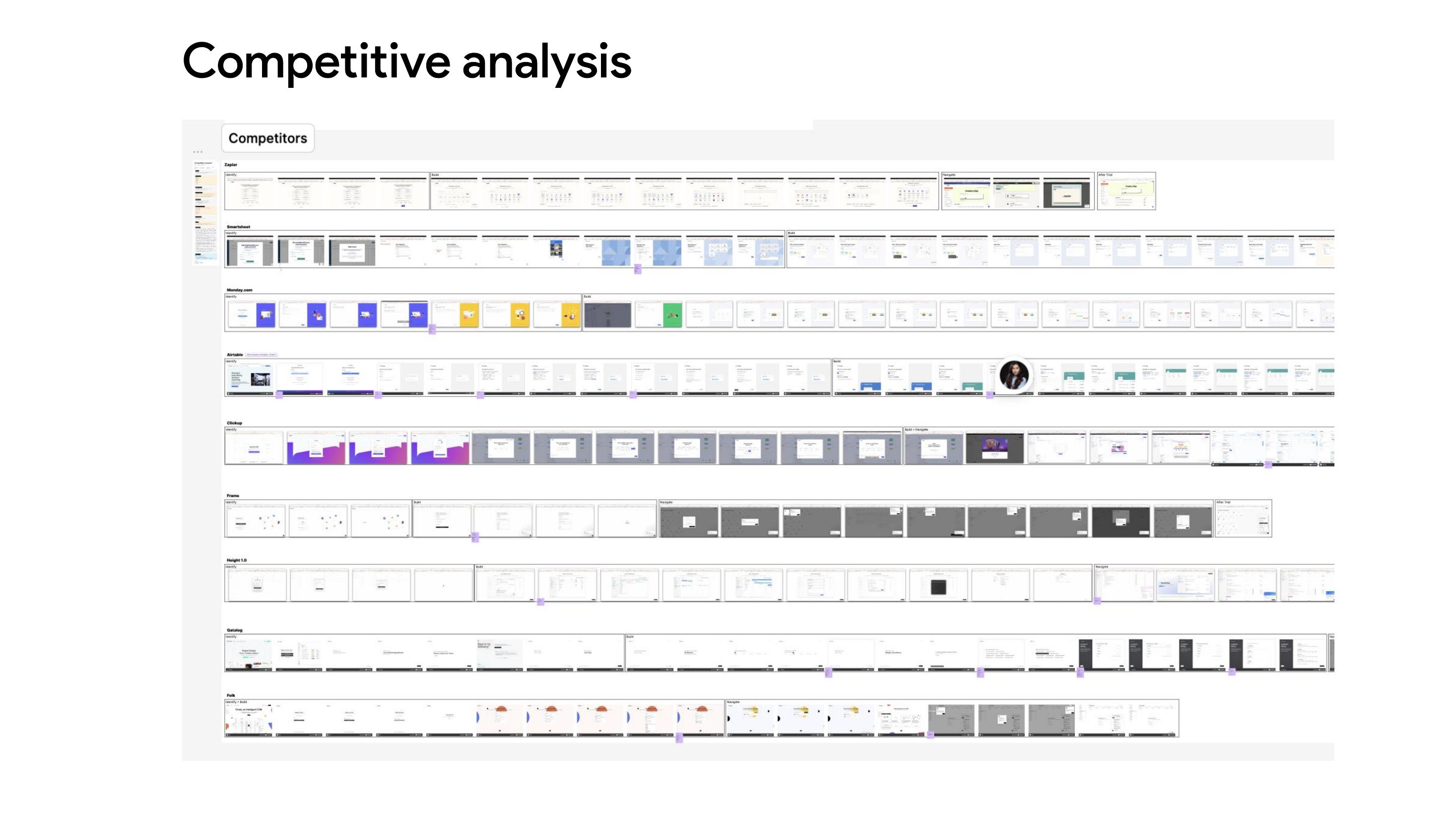
The takeaway was deliberately unambitious: this is a solved problem, and originality here is a liability. Users arriving at an onboarding flow are pattern-matching against every other tool they've tried. The design goals that came out of it:
- Stick with familiar, established patterns
- Make the flow shorter than every competitor's
- Keep it consistent enough with other Quickbase flows that it doesn't feel bolted on
- But elevate the visual craft and use the newest components
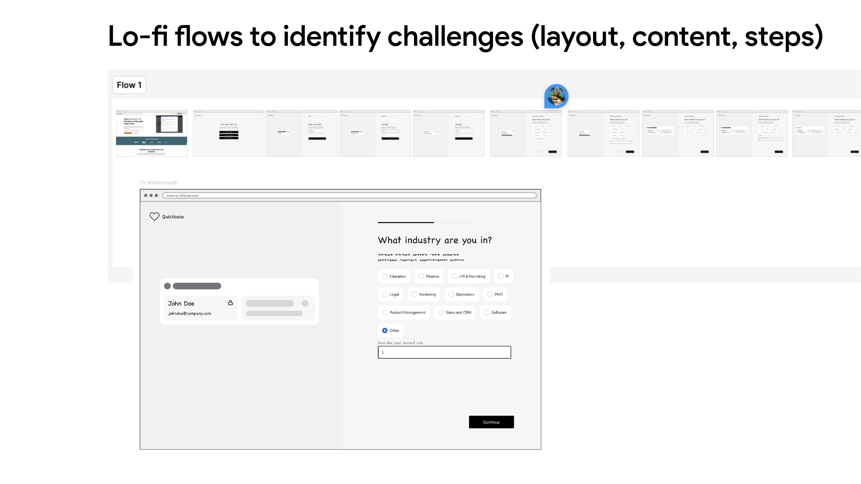
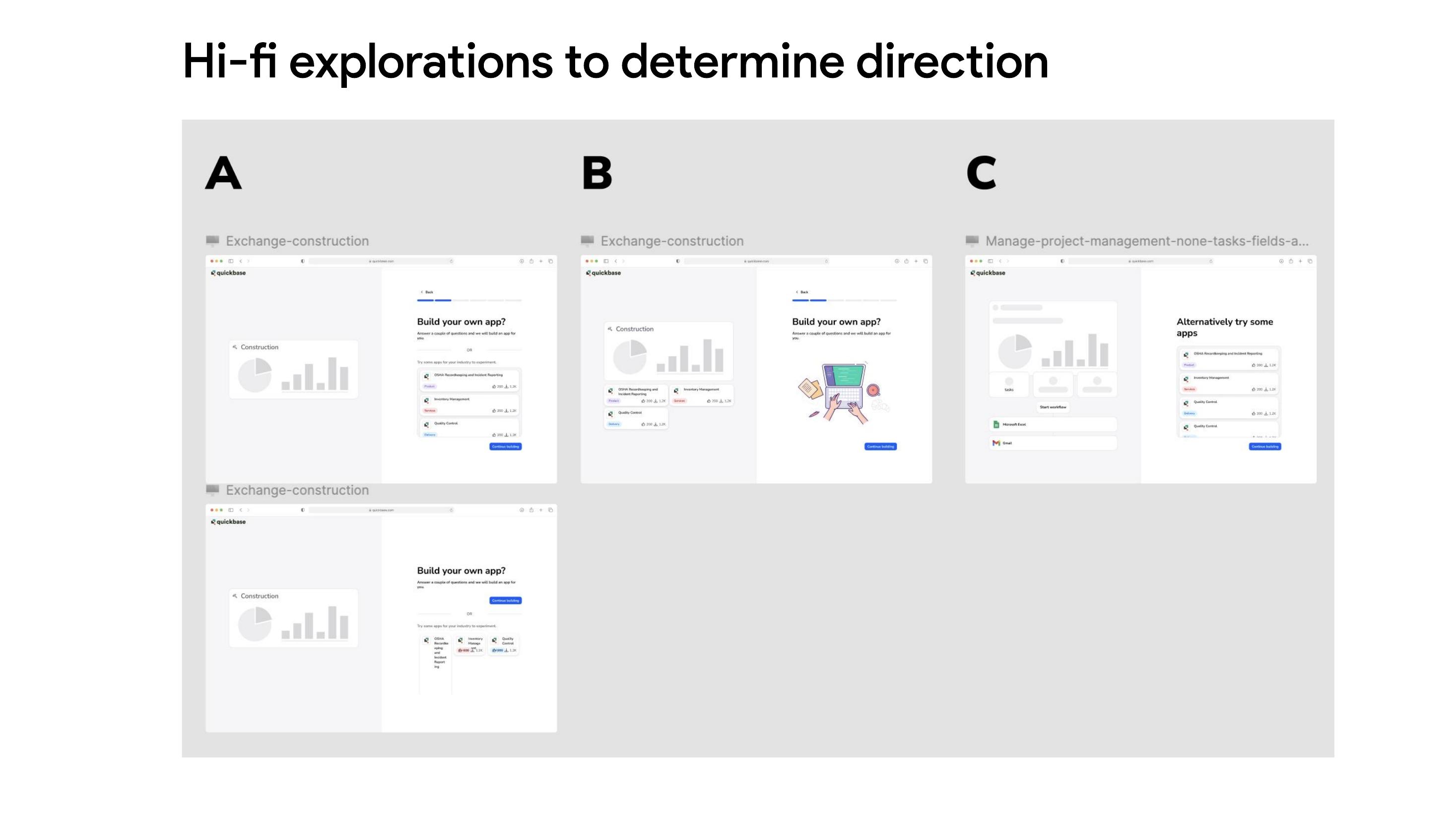
- Keep it technically identical to the AI onboarding so the A/B comparison stays valid
That last constraint mattered more than it sounds. It's what made the result trustworthy rather than merely favorable.
The result
732 users in the test group, 1,034 in control.
- +53% discovery calls, at 97% certainty
- +87% sales-qualified opportunities, at 98% certainty
- 89% reduction in time to first app created
Over 97% of users chose a pre-configured option rather than "other."
A separate finding came out of the same work. Reviewing the AI builder's intake form alongside our Customer Advisory Group, I proposed expanding it from one open field to three structured ones, mirroring the questions the advisory group said they'd actually ask a new customer. That change wasn't an AI improvement — it was a UX one, and it lifted conversion 19%.
What this project was really about
The hypothesis turned out to be right, but that's the least interesting part. The useful outcome was that the organization got a clean, statistically sound answer to a question it had been resolving by opinion — and it got that answer from a design team that proposed the experiment itself.
Full deck
Quickbase trial onboarding project deck · Open full deck